Showing posts with label Drawing. Show all posts

October 12, 2018

Art Journaling Prompt

Hello Creatives,

It's art journaling prompt/ sketchbook time!

This project is in a mixed media art style and pretty easy, so it could be tried with kids in an art class as well. I created this as an example for my art class in the small group of kids that I teach, I will let you know if it's a success!


I think sometimes all you need to get going in your art journal is some instructions or a few prompts to follow.

So, I have created this for you today. Let me know if you try it, I'd love to see what you come up with!

You will need:

-Art journal/sketchbook
-Scrapbook papers
-Mod Podge
-Back & white print out of yourself or a loved one
-Acrylic paints
-Matte painting medium (I love to use gloss but I find it makes the pages stick in a sketchbook)
-Paint Pens

I began by sticking various pieces of scrapbook papers onto the pages. I had some scrappy bits that my art-class-kids had messed up. But not to worry, that adds to all the layering and textural effects! Tear or cut them up. Torn edges look good. Don't get precious :)

I paste the back of the papers with mod podge first, press them down, then paste more mod podge over the top. This helps to minimise wrinkling.


Cut around your black and white figure print out and paste onto the pages where you'd like it to be.

Then using medium & paint, add washes over the top varying from transparent to opaque. In some places the scrapbook paper gets completely covered. I added some petals around the 'love you more' piece, then painted in some dots and splodges.


Next up, take a small paintbrush and add some detail with a darker colour. I added outlines of a flower, but you could do anything here. You could add words, or shells, or toadstool for example. If you look at the last photo, I have added 4 points of interest with some visual space in between around the figure. 


I also added a wash of pale yellow over the cardigan, and painted some pink cheek circles in :)


Add more paint and washes if desired. I used a white paint pen to bring some texture back into the clothing.


Add some more medium-paint-mix here using darker colours thinned out quite a bit, and rub back, manipulate and push the medium around using a tissue. This creates some extra depth and texture.


Last of all, when it's completely dry (don't be impatient like me and ruin your paint pens), take some paint pens and doodle over the top however you would like.


All done! What I love about a set of "instructions" for art journaling/ sketchbook work, is that you can take some of the decisions and fear away from what to do, take the cues and just enjoy the creative process.

Enjoy!

Jules :)

October 31, 2017

The Making of an Illustrated Children's Picture Book: Part 2

So I left the last post about illustrating a children's picture book at the story board stage. You can read about part one here.

*Update. Things have been a little slow here lately on the blog. I have reevaluated my priorities and time commitments and for the rest of the year I will still post here, but not as frequently as I was. I will reassess in the new year and decide what direction I want to take with all my arty and crafty projects. I'm still producing tutorials, and will update here on my creative life now that my latest kids book is finished, but for the rest of the year it's going to be a bit slower here on the old blog! Ok, back to the blog post!*

After everyone is happy with the way the whole book goes together, it's time for the final roughs.

With this book, some of the pages were shuffled around and text needed to move and new quick roughs needed to be done. It is in this stage when you see the images with the text that something you feel needs to be changed will become apparent, where it might not have been before.

A section of a rough from one of my favourite pages

The text is a huge part of the book and needs to not be an afterthought. I designed where the text would go in this book, and had a lot of help from a designer. The space for type is allocated before the final roughs are done.

Looking through kid's picture books is interesting to look at the amount of space type takes, the placement, size and font choices. You'll see wavy text, enlarged text, bold text, hand written text. The choices are varied, just as the illustration choices are.

I do my roughs to scale. I did mine larger than the final book would be, so I can fit more detail in where needed.

Some pages need more nutting-out than others. Some I wrestle with and redraw parts, and I also use my scanner and photoshop to help me rearrange parts of the roughs if it's not working for me on paper. Modern technology!


Some come easily. I'm sure this is similar to the workings of many different creative pursuits.

Things that I have to keep in mind when doing the roughs are character continuity, and keeping the style throughout the whole book. I also nut out landmarks or features if there are a few pages that will feature the same area. You want the same colour & shaped roof on the same house on different pages for example. Notes are helpful for you to remember things when it comes time to render the final illustrations.

I read and reread the text, as it's easy to miss out on little details that you thought you would remember.


Once the roughs are all done they are scanned in, edited and compiled into a PDF for viewing by the publisher. For my last kids book, I made a little dummy book which I loved. It was great to be able to pick it up and hold it and flick through the pages and get an idea of the final look and feel of the real book.

Extra detail is added into the final roughs, and I like little surprises such as continuing themes that aren't in the text of a book. It's great to think of all your characters (and even background characters) as total individuals so you can make them unique in their expressions or what they're wearing.

Taking breaks is important. Minds go stale and tired, and after a break I return fresh with new perspective.

So many tea breaks :)

If I get a bad case of the fears, also known as procrastination, I remind myself that no matter what I do, I will always be better off sitting down and doing an hour or so of work. If will learn something. I will progress, even if just by a tiny bit. Even if it's a stuff up, it's a stuff up that needed to happen as it is part of the process. This mindset has helped me deal with procrastination a lot. No matter how dull and practical and unmystical that is!

The cover design needs some in-depth thought and a fantastic illustration. I'm hoping mine lives up to the task! It is after all the first thing you see, and it either catches your eye or it doesn't. I did a couple of different layouts, and it was funny that in a survey to some little people they all chose the one I liked least! Considering it's for kids, we decided to trust those fresh untainted opinions, and that they knew best.

The next instalment will be regarding painting the finals, and the final book will be on it's way very soon! Stay tuned!

Next up... painting the final illustrations


Jules :)


June 26, 2017

Make At That Sells: Children's Picture Book Illustration

So, I have finished the children's book illustration part of the Make Art That Sells course that I am taking. I have one assignment to go. I'm doing MATS A which has five illustration components: bolt fabric, home decor, children's books, wall art & the gift market. You can find some links at the bottom of this post for the illustrations I've done for this course.

So, on to the children's book illustration part! We were given a story to illustrate called "The White Cat".  We could illustrate the cover, or an internal page spread. I chose the latter. It was an old story (I'm guessing it was old) and was quirky in the way that older fairy tales usually are. The cat is a princess under a spell, and that prince there is riding a wooden horse (the horse is also under a spell). 


This particular part of the story where the prince was riding a wooden horse and the cat a monkey appealed to my love-for-the-strange. As my kids say "you love weird, don't you Mum?" Yes, poppets, I do :)

My favourite part of the illustration is the cat riding the monkey. Here's the rough pencil drawing for that part..


The next picture is from when I was about halfway through drawing & painting the illustration. I used coloured pencils, and acrylic paint with medium. You can see here my enlarged rough that has been taped together. I like to enlarge my roughs on computer to the size I want to paint the illustration, then print it out in sections and piece it all together. That way I can work as large as I want.


I put variations of colour into the tree & the monkey. And because the story seemed vintage-y to me, I wanted the colours to have a vintage children's book feel to them. I think I was channelling a picture book from my past with this. Not that the illustrations are similar at all, but I remember the feel I used to get when reading that particular book and I think I was trying to capture that.

Detail

I'm really enjoying the MATS class and I only have one more assignment to go! I'm learning a lot, and growing and expanding with each new assignment. I love checking out all of the other students' work in the class galleries, and the tips and advice sprinkled throughout the course. 

If I had the time I'd just sit around doing online courses! 

You can check out my other illustration projects for MATS A here:


Make Art That Sells Illustration Course- gift market illustration (coming soon)

Jules :)

June 23, 2017

Art Journaling Prompt: Collage & Mixed Media

An art journaling prompt for you today, using collage & mixed media.


I used collage to kick start this sketch book entry, scrap book papers, and some images printed on my ink jet printer at home.

Sometimes all you need is a few prompts to get you started on some new pages in your sketch book or art journal. Follow this art journaling recipe along as closely or as loosely as you like!

You will need:

-scrapbook papers
-printed images
-mod podge
-acrylic paints
-matt medium
-coloured pencils

Head over to The Graphics Fairy to find some copyright-free print-quality images that interest you and print a few out at sizes that will work well in your sketch book. I was quite drawn to the bird images. I had to shrink the images as they are quite large which is great to know for other projects :)


Take some decorative/ scrap book papers, cut some smaller pieces and start sticking them in with mod podge (pva glue also works, but I like the archival qualities of using mod podge).


Once you have some decorative paper stuck in, start filling in the blank pages with acrylic paint. Feel free to mix in some matt medium to make the paint washy or just to make your paint go further.

I like to stick to using matt medium so that I can draw over the top of the paint with coloured pencils.

Cut you ink jet prints out and glue them in place, covering the whole reverse side of the images with mod podge. I always put glue on the reverse side of the piece I'm sticking down, rather than the sketchbook.  It helps to avoid the piece you're sticking down wrinkling.


Once firmly stuck (I give them a few minutes- go make a cuppa) paint over them to seal the ink with some matt medium. When you're sealing, work lightly and only one stroke over each section of the image to prevent the printer ink shifting.You can do a second coat if needed once the first coat is dry to make sure it's totally sealed. This seals the printer ink so you can work over the top with paints etc without the ink smudging. (As ink jet ink is not waterproof when dry, but laser copies are.)


Once everything is dry again (use a hair dryer to speed things up), use some coloured pencils on top. Draw shapes, patterns, scribble a bit, and/ or add some hand drawn type. Just doddle and have some fun.


Then take out the acrylic paints + matt medium again. Mix colours close to your background colours and paint around the white bits, if there are any, around your cut outs.


You can also add some more interest with paint by adding some spots and detail into any shapes or patterns that you decided to draw.


I added some more detail with my coloured pencils. I thought those black birds needed some more contrast so I added some black pencil to them to make them stand out.


Dilute some acrylic paint with medium and add some washes over certain areas. If you're unsure about mixing colours, keep it simple by only mixing a couple of colours together to avoid muddiness, and that will help to keep your colours fresh. 


You can keep going and adding more patterns, washes or detail with your paints or coloured pencils, or else if you are happy with how it looks you can stop there. 


So there you go, an art journalling recipe for you to try! See what you can come up with!

Jules :)
April 23, 2017

Some Sketch Book/ Art Journal Images

This post may contain affiliate links (see bottom of post for explanation).

I have been making more of an effort lately to do regular artwork in my sketch book. Thought I would show a few pages that I've been working on recently. You may have seen some of these already if you follow me on instagram or facebook.

These pages are still in progress

The above art journal pages are a work in progress. I used the book Botanicum as the inspiration. If I see photos or images that inspire me I use the colours and shapes as rough guides for my line work or style of painting. I don't directly copy, but I find elements within the image to inspire the direction I take. I may use some shapes, patterns or colours to influence my work.

Botanicum has really nice colour palettes and interesting shapes to explore

Processes I like to use when working in my art journal or sketch book are colour washes (using them like watercolours) with acrylic paints, using my prismacolor pencils, collage with decorative papers or previously painted paper or sketches (even failed prints can become material for collaging), thick paint overlaying thin washes, and also the use of different mediums mixed in with acrylic paint. Paint pens are also a new found love and are lots of fun.


I also like playing with hand drawn & painted type in my sketch books.


I can get as strange as I want in my sketch book. The beauty (I've said it before and I'll say it again) of the sketch book/ art journal is that there is no pressure. It doesn't matter if the work doesn't turn out how you want it too. You're creating this for no one and no one has to see it if you don't want them to!

A lot of spots and dashes and repetitive lines are making their way into my art lately

I love sketch books/ art journals as they are so portable. You can make up a bag of supplies and take them with you when you go out. I usually just take my coloured pencils and my sketch book; although I'm working out how to make my acrylic paints more portable! I'm thinking a small sealable jar (for water), a paint palette with a lid (possibly a small flat plastic container) and some extra smaller tubes of my favourite colours that can live in a devoted bag, a couple of brushes in a tin and a rag or tissue for drying them. I need to get organised! I really miss my acrylics when I take my sketch book out. 


My favourite all time sketch books are the Moleskine brand. Not because they seem to be the 'in thing'... but because of their paper quality, the way the pages lay out flat to create in, and the way the pages hold up to layers of paint without buckling too much. I love the smooth surface too, I don't really like paper texture when I'm creating, or paper that is too absorbent, but that is just my personal preference.

I hope you enjoyed my sketch book round up! I really do want to make more of an effort to be more regular with creating art in my art journals. 

Jules :)

*Affiliate Information: Affliliate links help me earn small commissions on products (at no extra cost to you), which helps support my love of blogging and sharing creative things. I only ever recommend or link to products that I'm genuinely into.

April 14, 2017

Getting Inspired by Kids Films

Kids art. Love it!

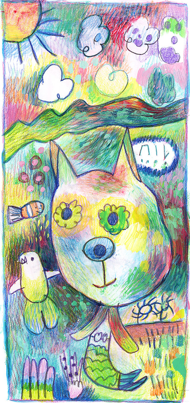
Miss I was watching Moana for about the zillionth time, and she was drawing as she watched it.

I loved her pencil drawing so much, I scanned it into my computer, enlarged it and printed it out. I coloured it in directly onto the printout, with my prismacolor pencils, then used acrylic paints & medium to give it some more colour.

painting, drawing, colorful art, colourful art

The creature in the middle is a cat mermaid. The little lines down the right hand side bottom are apparently shrimp. 

I think the clouds in the top right are drawn from the lava creature that is at the end of the movie. There are a few spooky parts in the movie for young kids; but overall we are totally in love with this film. Have you seen it yet? 

I love the crab, the character design of him, the way he talks, all the sparkly collected things he has on his back. My girls crack up when he says that he ate his own Grandma, and it took a week because she was absolutely humungous! Kids movies are so fantastic these days. I think they put lots of adult humour in there for keeping the parents entertained too. 


The realm of the monsters was my favourite part due to the colour and seaweedy shapes covering underwater structures. They look like quirky sculptures. The crab I love lives down there in the realm of the monsters. Moana is definitely a creative film. (I tried to find a brighter picture of the realm, but this is all I found. Still very beautiful.)

I just love how this story is about a strong female figure with a leadership role in her community, and she doesn't even fall in love! Love is great n all, but most female characters in disney movies end up swooning over some guy, right!? So refreshing.

I'll leave you today with a quote. So simple & beautiful.


Have a great weekend!

Jules :)


LinkWithin

Related Posts Plugin for WordPress, Blogger...
01 09 10